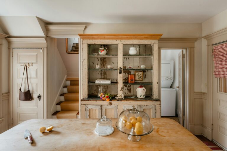
A well-painted cabinet finish can elevate a kitchen, but the overall result depends on how well countertops and backsplashes are coordinated. Mismatched materials or colors can make even high-quality cabinet work look off. The goal is balance—contrast where needed, cohesion where it matters.
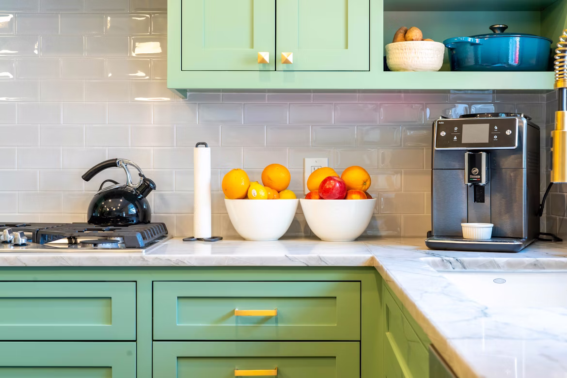
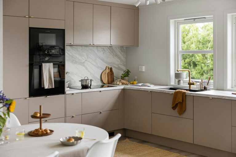
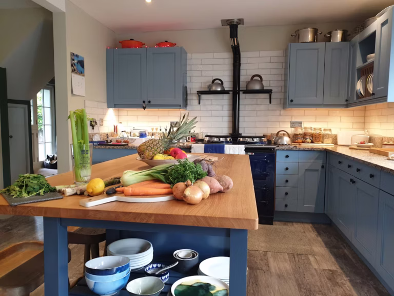
Start with the cabinet color as the anchor. Painted cabinets define the visual weight of the kitchen, especially with bold tones. Light cabinets (white, cream, soft gray) allow more flexibility with countertops, including darker stone or patterned quartz. In contrast, dark cabinets (navy, charcoal, deep green) benefit from lighter countertops to prevent the space from feeling heavy.
Countertop selection should focus on both color and pattern. If cabinets are a solid painted color, countertops can introduce subtle movement—veining in quartz or natural stone adds depth without creating visual noise. However, if the cabinet color is already bold, avoid overly busy patterns. Clean, controlled textures tend to look more expensive and age better.
Backsplashes act as the transition layer between cabinets and countertops. This is where many mistakes happen. A backsplash should not compete with either element. If the countertop has strong veining or pattern, keep the backsplash simple—classic subway tile, slab backsplash, or a neutral matte finish. If both cabinets and countertops are relatively calm, the backsplash can carry more visual interest through texture, shape, or layout.
Color temperature is often overlooked. Mixing warm and cool tones without intention creates a disjointed look. For example, warm off-white cabinets pair better with beige or cream-based countertops, while cool white or gray cabinets work best with crisp white, black, or blue-toned surfaces. Hardware and fixtures should follow the same temperature logic to maintain consistency.
Material finish also plays a role. Matte cabinets pair well with honed or leathered countertops for a soft, modern feel. Glossy finishes, on the other hand, benefit from polished surfaces that reflect light and enhance brightness. Consistency in finish helps create a cohesive design language across the kitchen.
Lighting should be evaluated before final decisions. Natural and artificial light can significantly change how colors appear. A countertop that looks neutral in a showroom may appear too warm or too cold under your kitchen lighting. Always test samples directly in the space before committing.
For a practical approach, follow a simple rule: one dominant feature, one supporting element, and one neutral. For example, bold painted cabinets (dominant), subtle quartz countertop (support), and a clean backsplash (neutral). This prevents visual overload and ensures the kitchen feels intentional rather than chaotic.
When done correctly, matching countertops and backsplashes with painted cabinets creates a cohesive, durable, and visually balanced kitchen—one that looks professionally designed rather than pieced together.