Neutral kitchens have dominated for years, but bold cabinet colors are now taking a firm position in modern interior design. Shades like navy, emerald, and charcoal offer depth, character, and a high-end look without requiring a full renovation. When applied correctly, these colors can transform standard cabinetry into a focal point.


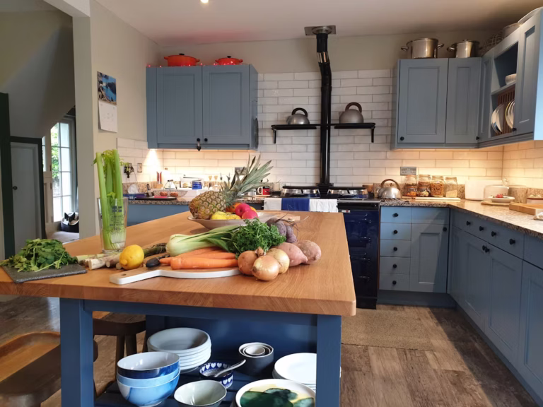
Navy blue cabinets are one of the most reliable ways to introduce color without overwhelming the space. This shade works particularly well in both classic and contemporary kitchens. It pairs effectively with white countertops, brass hardware, and light backsplashes, creating a balanced contrast. Navy also hides minor wear better than lighter tones, making it a practical choice for high-use kitchens.
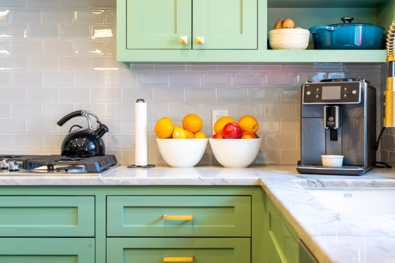
Emerald green is a more expressive option, often associated with luxury and custom design. It brings warmth and richness, especially when combined with natural wood elements or gold accents. Emerald works best in spaces with sufficient natural or artificial lighting, as darker green tones can feel heavy in poorly lit kitchens. When used strategically—such as on lower cabinets or an island—it delivers impact without overpowering the room.
Charcoal gray sits between black and traditional gray, offering a softer, more adaptable alternative to pure black cabinets. It provides a clean, modern aesthetic while maintaining versatility across different styles. Charcoal pairs well with stainless steel appliances, matte black fixtures, and concrete or quartz surfaces. It is also one of the easiest bold tones to integrate into existing interiors without major changes.
Choosing the right bold color is only part of the process. Surface preparation and application technique determine whether the final result looks professional or uneven. Dark, saturated colors tend to highlight imperfections, so cabinets must be properly cleaned, sanded, and primed before painting. Spray application is typically preferred for achieving a smooth, factory-like finish, especially with deep tones.
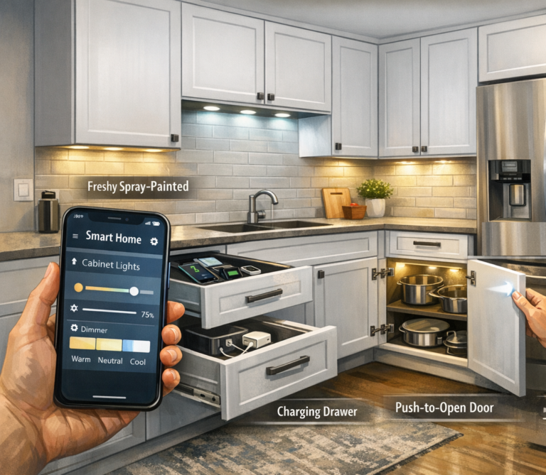
Lighting also plays a critical role. Bold cabinets absorb more light than white or beige surfaces, so it is important to balance them with lighter walls, reflective materials, or under-cabinet lighting. Without this balance, even well-painted cabinets can make a kitchen feel smaller or darker than intended.
For homeowners considering a kitchen refresh, navy, emerald, and charcoal offer a strong alternative to safe neutrals. These colors provide visual interest, increase perceived value, and allow for more personalized design. When combined with proper technique and thoughtful styling, bold painted cabinets can deliver a durable and visually striking result that stands out without sacrificing functionality.